10 Fonts Your Business Needs to Avoid
- 10 May 2019
10 Fonts Your Business Needs to Avoid
You may remember when we looked at the best fonts for signage. And whilst this is incredibly useful, it doesn’t cover those terrible fonts you should be avoiding at all costs. Whether you’re producing a new banner or looking to give your branding a makeover, there are some fonts you should simply stay away from.
Comic Sans

It was kind of cool back in the 90s but Comic Sans has earned a reputation for being one of the worst and least professional fonts out there. With so many free fonts now available, there is no excuse to be using this one.
Curlz
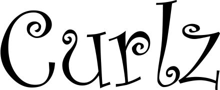
It might work for a hair salon – maybe – but fonts with curling ends and a slightly cartoonish look are just not good for business. It may seem fun and funky to start with but it doesn’t instil much confidence in the customer.
Papyrus
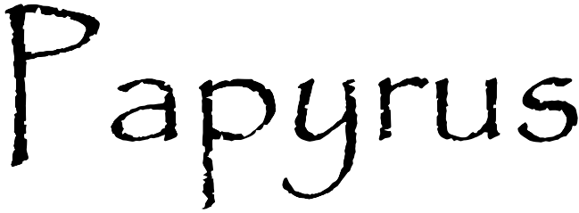
Whilst it worked on the posters for Avatar, this really isn’t a font you should be messing with. Typography can say a lot about who you are and, unfortunately, this is one of those fonts that’s been used a million times. When Microsoft Word originally unleashed a whole library of options, it was just about acceptable, but not now.
Impact

It might be big and bold, but this font is too easily associated with hardware stores and cat memes. And whilst everyone loves a good meme, positioning your business alongside the meme market is maybe not a great idea.
Arial
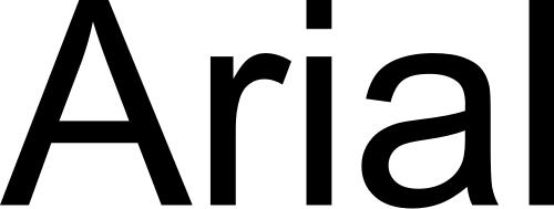
So Arial is a great standard font but it’s boring. And very transparent; using this on your business messaging will only tell people you don’t want to invest in yourself and use a more custom, individual font. If you won’t invest in you, why should they?
Brush Script

Other than being awkward to match complimentary fonts too, Brush Script is just plain hard to read. You need something simpler and less fancy so that your customers can easily identify who you are without the added complication of having to decipher your message.
Vivaldi

Okay, so Vivaldi just screams Italian restaurant or wedding invite and the unnecessary curls and flicks just make it overly dramatic. Many companies choose to use this font based on it looking like calligraphy but in fact, this cheap imitation isn’t going to win you any business.
Kristen ITC

If you’re going for the cartoonish children’s font, then Kristen ITC is the one for you. As a business choice, it’s not great and doesn’t lend an air of authority that you know what you’re doing.
Mistral

Let’s face it, this font is almost impossible to read and suffers from the same problem as all script fonts: customers just won’t take the time to understand the writing. You need a font that will be easily readable at just a glance, and Mistral is not it.
Read more: 10 Fonts that are perfect for signage