Poster Designs: The Hits and Misses
- 27 Apr 2020

Poster Designs: The Hits and Misses
As a leading supplier of poster cases and snap frames in the UK, we’ve seen our fair share of posters over the years. Some of these posters have been hits, driving a great amount of awareness and traffic towards the business, event or message the poster was designed to promote, while some have been less successful. Today, we’re going to look at some well-known posters and discuss why they were and weren’t so successful to help you to understand what should be avoided in poster design, and to come up with some ideas for your own poster campaign.
Posters are nothing new: within pop culture, they’ve been the medium behind some of the most iconic pieces of design we’ve seen. Anyone can instantly attract an audience for their promotion or business. A good poster encourages anyone who sees it to take a desired action by combining an attractive design and a catchy slogan to produce an eye-catching advertisement.

Let the 2020s be the decade your business really masters its branding. We’ve entered a strange point in history, where a pandemic lockdown has meant that fewer people are on the streets to see pavement signs or pick up brochures. One strength of posters is that once you’ve created your design, printed and framed it, you can easily share pictures of the design online for people to appreciate.
Posters have been a constant point in advertising for decades, but the designs that appear on them are constantly evolving. Trends change quickly and can become very outdated with time, especially in the age of the Internet. But anyone with an interest in design will know a good poster when they see it, and those are the designs that can come back again and again.

our regular customers and passing foot traffic need to be kept in the loop about upcoming sales, and there is still no better way to grab their attention than with bold and eye-catching posters advertising your offers. Similarly, if you are having an upcoming event, charity raffle, pub trivia night or party, you need to get the word out there. As long as you can boldly alert them that you have what they need, your business is going to flourish – and that is where a poster case comes into play.
So how do we make sure our posters are hits, and what features should we be avoiding? There are so many different types of design out there – it’s time to find your perfect poster.
Read more: Tips for Designing and Protecting Your Poster

Hit: Glastonbury Festival 1982
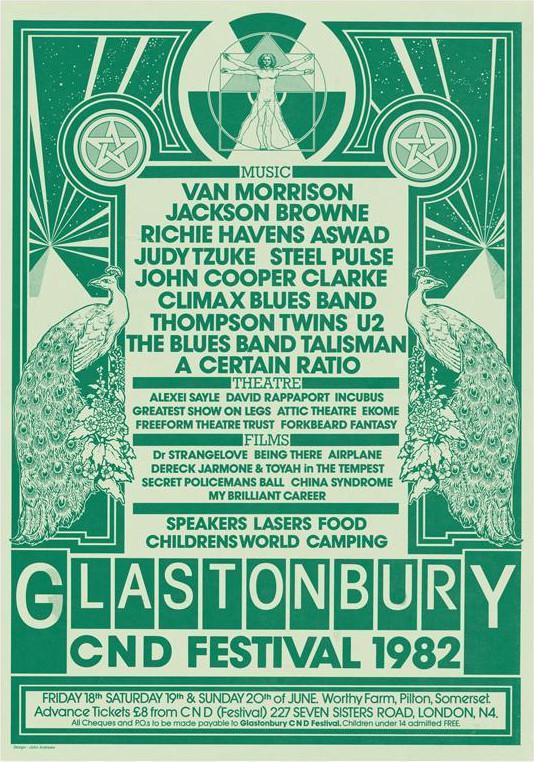
Images and text are balanced perfectly in this gorgeous bitonal poster, and the headline act couldn’t be clearer. The festival’s famous Pyramid stage is combined with beams of light and peacock designs to create a simple reflected image that lends a sense of symmetry to the poster.
The event’s three categories – music, film and theatre – are divided to make the poster easy to read, and all of the acts have all the space they need to be able to breathe.
It may seem self-contradicting, but a vintage design like this could be perfect to give a fresh new start to your shop’s snap frames or poster cases.
Miss: Daddy’s Home (2015)

This movie poster doesn’t look completely awful at first. The eye gets to enjoy some symmetry, the two lead actors are plainly visible, the premise is clear and the font is easily readable. But actor Mark Wahlberg’s right leg seems to be going walkabouts and it’s all just a little… off.
Human eyes are trained to recognise other human forms and when something’s not right, the results can be unsettling. If you’re using human bodies or faces in your poster, make sure you don’t warp them with too much cropping or stretching.
Poster Cases
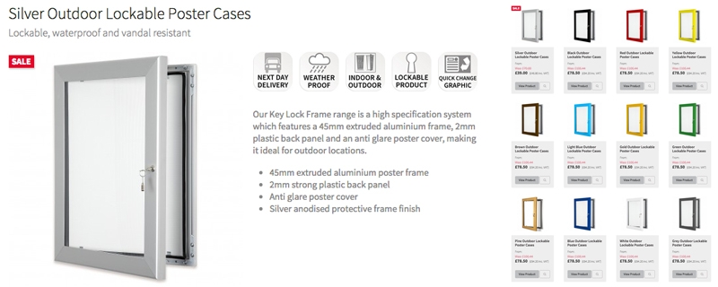
A good poster case, outdoors or indoors, can be really beneficial to your office – as it will be to any office, preschool, college, university, local authority, public area, corporate building, shop or restaurant. There are lots of different types of poster display out there, so when you’re looking for a new poster case for your business it’s easy to get confused. You need to opt for a product that’s designed for use where you plan to use it – a simple snap poster frame for indoor use, for example, or a lockable poster case or outdoor menu display case for outdoors – so that you can grab the attention of potential clients every day of the week and entice them into your business.
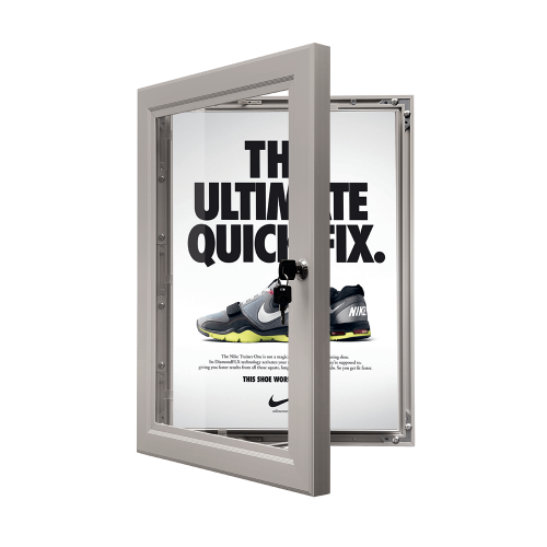
If you want something that can be used indoors or outdoors, our menu cases have a waterproof seal and lockable door, and are perfect for displaying information for bars, estate agents, restaurants, cafes and food outlets. This tool can be used by any number of different business types, owing to its real versatility. The following uses are worth considering if you’re unsure what you can use yours for.
- Make sure your name and logo will be remembered by everyone by using a menu display case that has built-in LED illumination outside your business.
- Your office staff room our canteen can be livened up with a menu case to display the food on offer or any upcoming events.
- Display information about your most popular services in a poster case outside your business. Help draw potential customers to your display by following the tips for good poster design outlined in this article.
- Information about interesting events like plays, shows and fairs can be displayed in poster frames in populated areas like shopping centres.

Read more: Posters: Content, Colour & Design Tips
Hit: Glastonbury Festival 1986
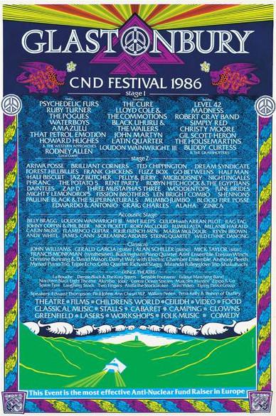
Another Glastonbury example, this poster is very different from the first item on this list. This design is actively steering away from early attempts to pin one “brand” to the festival, but it still follows two branding principles of vibrant colours and a strong logo concept. It displays all of the necessary information in a clear and attractive way, and accurately captures the values of the event it promotes.
You Can Use Poster Cases to Alert Your Customers to Deals, Sales and Events
Traditional printed materials like a well-designed poster are still the best way to attract excitement and curiosity to your business, however popular your social media accounts and website become. Your business can use a well-placed poster to cause someone with no intention of stopping to stop in their tracks and head your way. Just hang your perfected design in a durable poster case and watch the money really come rolling in – a Facebook post has nothing on a good poster.
The RSVPs for your event or promotion will start to mount as soon as you put your poster out there.
Read more: Why Your Business Should Consider Poster Cases
Miss: Where Magazine
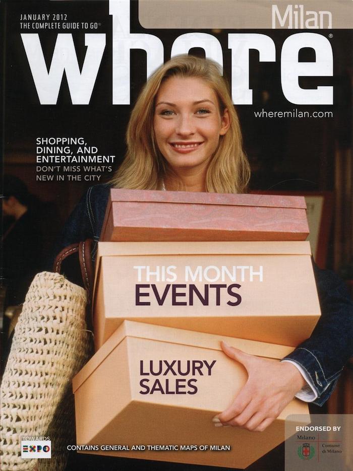
Poster designers, please pay attention to the location of your text. Important graphic design lessons can be learned from this issue of Where magazine – “where” as in “what location?” – when it comes to composition and layout. The colours are great, the photo is great, and the woman in the photo is a true professional. This all falls on the editor.
When you design your poster, try to make sure all of your text is fully visible. If you do choose to have some part of the image covering part of the text, make sure it’s still clear what the word is actually meant to say!
Miss: Glastonbury Festival 1989
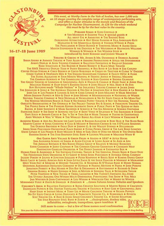
They can’t all be winners. This poster looks more like a lyrics sheet than a list of acts, and it’s really difficult to actually focus on it long enough to take in any information. Best practices are certainly not being followed here, and the design is a little on the lazy side. With all the acts the same size, how are festival goers to identify the headliners? There could be a really exciting artist somewhere on this list, but if it’s not in the first line or two, only those with some real staying power will find them.
Hit: Coca-Cola, c. 1930

Many of modern history’s most iconic pop-culture images have come from advertisement posters. For posters that have stood the test of time from the 20th century onwards, we just need to look to brands like Nike, Coca-Cola, Heinz and Apple. Perhaps their strength comes from the fact they were designed to work in many concepts, as posters, magazine features, newspapers and billboards.
Miss: Glastonbury Festival, 1993
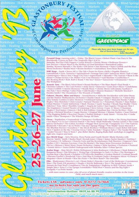
Graphic design went through an interesting phase in the 90s and while some designs have now become sufficiently “retro” to come back into fashion, others are just irredeemably bad. Who would have thought a lineup featuring Blur and Bob Dylan could look so unappealing?
It’s generally a good idea to hire a professional for your poster designs, but this poster doesn’t give us much hope for even professional graphic designers.
Read more: A Guide to Creating the Perfect Poster
Shop here:
