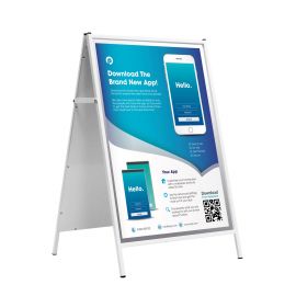
Get Your Shop Noticed with A-Board Signs
- 17 Jun 2020

5 Tips for A-Board Signs that will get your ‘bricks and mortar’ shop noticed
Are you leveraging the power of A-board signs to boost the success of your business? If not, you are missing valuable opportunities for sales and advertising. We’ve compiled 5 tips to help you design and post eye-catching signage in your A-board sign frames.

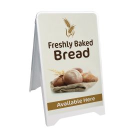
Bricks and mortar shops benefit from visible A-board signs
While more businesses than ever are selling their wares online, bricks and mortar storefronts still thrive all over the UK. From the high street to the village square to the shopping centre, people still love to stroll from shop to shop. Is your shop front catching their attention as they walk past? If not, you need to change your signage strategy.
There are a number of different strategies you can use to garner attention for your business. By far, your retail signage is the most important. Even if you have spent time thoughtfully designing, writing, and printing your signage, if no one can see it – it won’t work.

Your signage needs to be bold and visible – it can even benefit from being a bit ‘in your face!’ Ideally, you need to catch every person’s attention and get them excited and intrigued about what you have on offer.
The key to retail signage success is visibility, visibility, and more visibility! If you place your signs in highly visible and accessible areas, they will outperform other signs in your shop. Ideally, they’ll also outperform others on the High Street.
Did you know that a visible sign can generate up to three times more foot traffic than one that is hidden away? When you own or manage a retail store, this can have a huge positive impact on your bottom line, and can be the difference between success and failure at the end of the year.

5 ways to use A-board signs to make your shop more visible
There are plenty of ways to make your A-board sign even more visible from any angle. Change its location, use contrasting bright colours, and optimise your written copy for success.
Here are five ideas for boosting your A-board sign’s visibility – and its success.
- Location, location, location
This isn’t just the credo of estate agents the world over! The success of your A-board sign will depend on where you place it, and how many people can see it. If you inadvertently hide it away, you’ll be cutting yourself off at the knees. Remember – the more people that pass by your sign, the more people will actually see it. The more people who see it, the more people will be compelled to follow your call to action! Even if your sign isn’t in the best condition (which it always should be!), if it is in a high profile location, it will be more successful.
Set your A-board signs in areas that benefit from high footfall, and a lot of vehicle and public transport traffic. Have a walk around your retail shop location, and have a good think about the busiest location nearby. If you can hit the ‘sweet spot’ you’ll increase your foot traffic in a meaningful way.
This is especially important when you are located in a mews, or down a small lane or pathway. Ask your neighbours or the local council if you can place your A-board sign on the pavement nearest your shop. Remember to secure it, and consider locking it in place. - Choose bright, bold, and contrasting colours
If you want to stand out in the urban landscape, you need to catch the attention of pedestrians and passengers alike. Now that your sign is in a highly visible location, you need to ensure that it is bright and bold.
Think about including contrasting colour schemes in your poster design in order to boost their visibility. Some high contrast colour combinations include white on black and yellow on blue. The greater the contrast, the easier it will be to read – and the more visible it will be to people passing by.
Always avoid green on red, gold on white, white on blue, and red on blue. If your text just blends into the background, or worse, causes a person’s eyes to blur, they’ll ignore it and walk on by. Of course, you want to include a contrasting colour, but you also don’t want things to clash or be too ‘loud!’
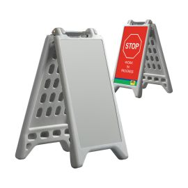
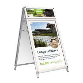
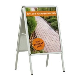
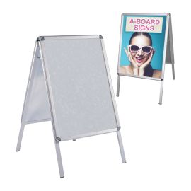
In addition to designing a bright and bold poster to insert into your A-board sign, you can also choose a brightly coloured frame. Red17 has made to order aluminium A-board signs in 17 different colours. - Make the copy short and sweet
Long, complicated, and complex copy is great for a brochure or a website page. It is not suitable for your A-board sign! If your written copy is too complex and long, people will ignore it and walk right past. A pavement sign should be short, sweet, and punchy in order to be effective.
Take a page out of Ernest Hemingway’s book and keep your copy simple and easy to absorb at a glance. You only have a few scant seconds to catch the attention of each customer – make it count! Think about it as a ‘2 second rule.’ You should be able to communicate your entire message in just 2 seconds or less.
If it takes any longer than this, you will lose the attention of a significant number of people. You can kiss their patronage goodbye!
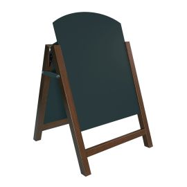
Another time-honoured strategy is to include puns or jokes into your signage copy. This works well for chalkboard signs – messages can be as fun and as cheeky as you think you can get away with! Check out some of the best chalkboard sign messages. - Address pain points, and include a call to action
Good copy is good copy, no matter where it is published. Your A-board sign should follow a pared down version of the formulas used to craft long form sales emails and brochures.
Remember – good marketing language uses personalised language to connect with people. Identify a problem they are experiencing, and then provide a solution. Of course, in a longer format you can be very thorough and in depth. On an A-board sign, you only have a few words to accomplish this.
Address your audience with personalised language, like ‘you’ and ‘your.’ Always finish off your message with a clear and focused call to action – what is it that you’d like them to do?
For example: “Are you looking for a new coat? Come check out our new arrivals.” “Feeling hungry? Come in for a delicious sandwich.” - Ensure that your font is clear and easy to read
While you might be tempted to play around with creative fonts, cursive, and loads of photos, it’s often better to keep things simple. The clearer your font choice, the easier it is to read at a glance. Remember – that is the ultimate goal! Choose a font that is big, bold, and clear.
Retail signage is always at its best when it is printed and arranged in a clear and crisp manner. Resist the urge to add too much decoration or design around your message. While it might look nice to you, it can distract the eye from your key message, and reduce the readability of your A-board sign.


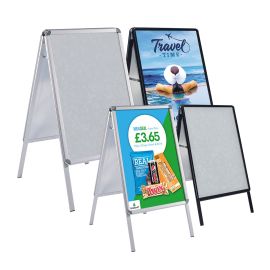
Selecting the best A-board sign for your needs
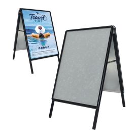
There are many different A-board sign options to choose from at Red17, including chalkboards, budget options, and coloured aluminium frames. If you have questions or need help selecting the right sign for your retail shop, feel free to give us a call.
Our friendly and knowledgable team is on hand to advise you on the features of all of our A-board signs. Call or email us today, and start getting loads of attention for your shop!
If you enjoyed this article, you may also like…
Shop here: